
TikTok users have once again left us all mindblown after realizing something painfully obvious about the Vans logo.
The symbol of the beloved brand of shoes is known to us all, but there is a secret behind it that has blown people’s minds…
Read on to discover exactly what it was that fans figured out!
But first, let’s take a look at more logos with hidden meanings…
We are surrounded by them all day every day, so it’s only right to understand them!
First up, the Japanese car brand Toyota.
We all know this one from the millions of Prius vehicles that we pass on a daily basis!
If you look closely, you will actually realize the logo spells out the brand’s name…

You can spot a T, O, Y, T, and A all within that little logo — genius!
Another famous logo with hidden meaning is that of Pinterest.
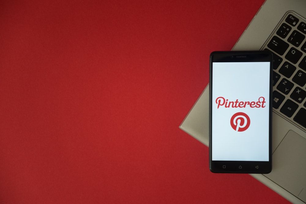
The social media site’s red branding is iconic.
But you might not have realized a detail about the beginning of its name…
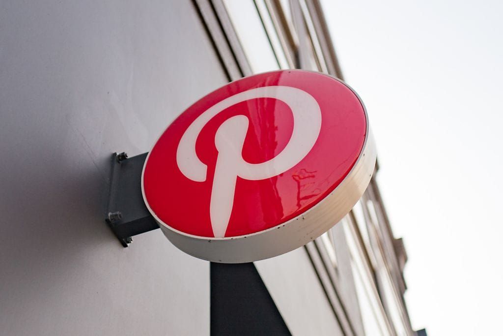
The ‘P’ in Pinterest is actually stylized to look like a board pin!
The branding for Le Tour de France is another brilliant one.
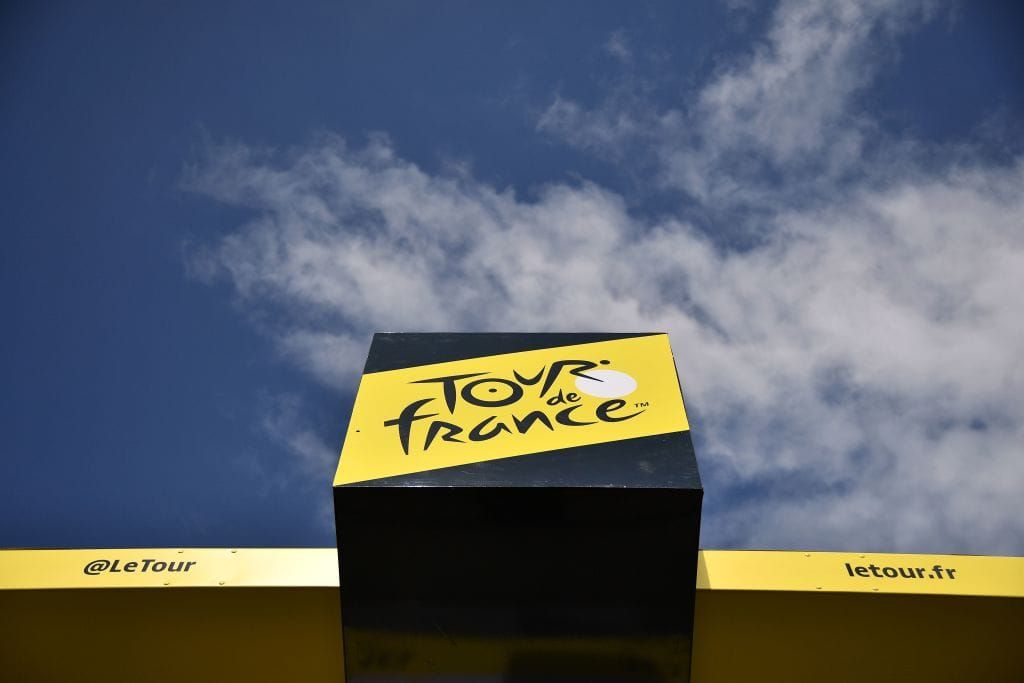
There is a very cleverly hidden meaning.
Take a closer look at the ‘O’ and you will soon realize there’s a cyclist nestled in the middle of the logo!
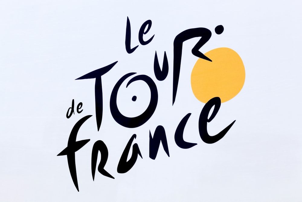
Genius stuff.
Next up is FedEx, whose hidden meaning is definitely more on the hidden side!
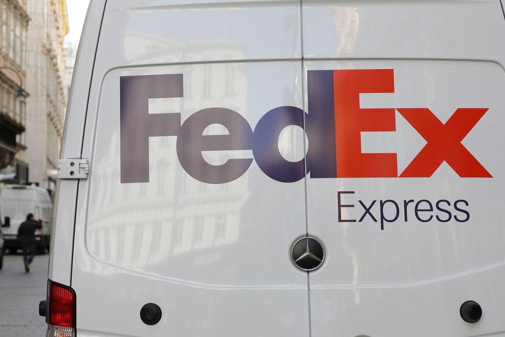
I never would have seen this one without help…
If you take a look between the ‘E’ and the ‘X’ there is a clever design trick.
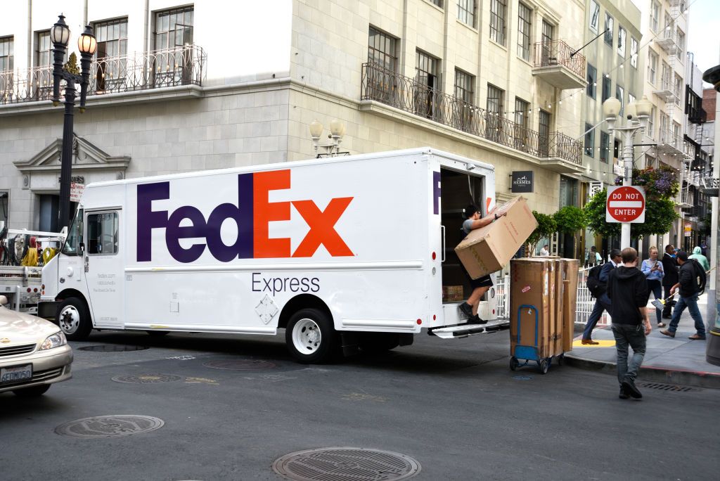
The way the letters are positioned actually creates an arrow, indicating the speed and precision that a delivery company should have…
Now, you can’t help but love a bit of Toblerone.
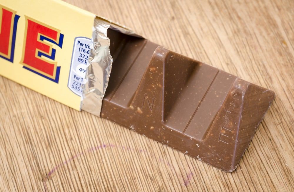
But did you know the famous chocolate is made in Bern, Switzerland?
Bern’s coat of arms features a bear, so it makes sense that the Toblerone logo does too!
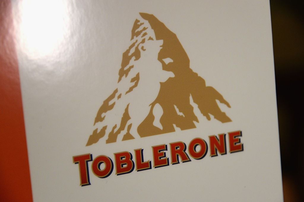
Honestly, how have we not noticed that before?
The Beats branding is another one that should be familiar to us all.
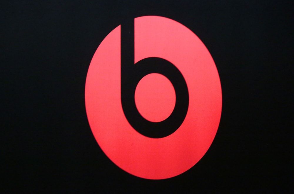
Dr. Dre’s audio company is well-loved by many.
The logo actually mirrors the products themselves – headphones!
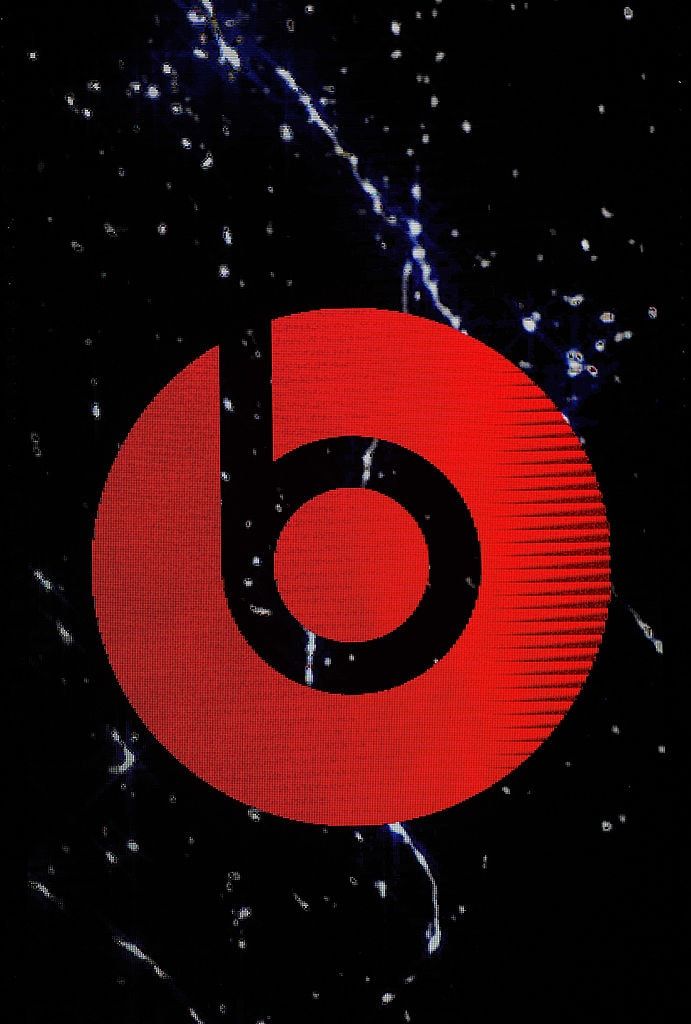
Look at it this way, and imagine a face to the left-hand side of the logo — it would look as if they have a pair of headphones on!
One of the most famous logos across the world has to be Amazon’s
And who knew it was so clever?!
Pay close attention to the arrow which goes from A to Z.
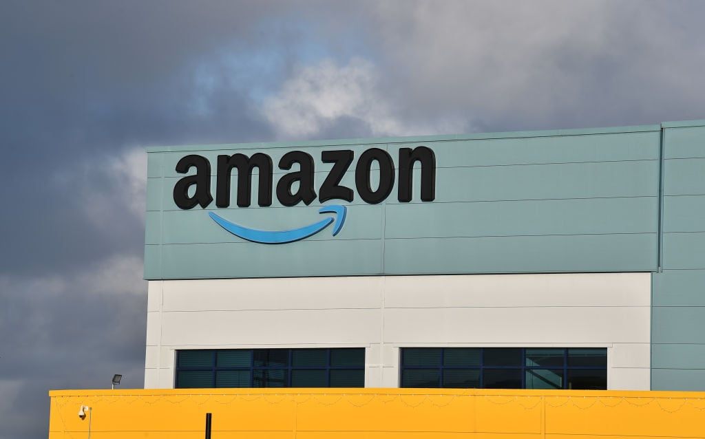
Well, Amazon literally has it all, from A to Z, with a smile… Get it?
Ah, the sweet symbol of ice cream — you gotta love Baskin Robbins!
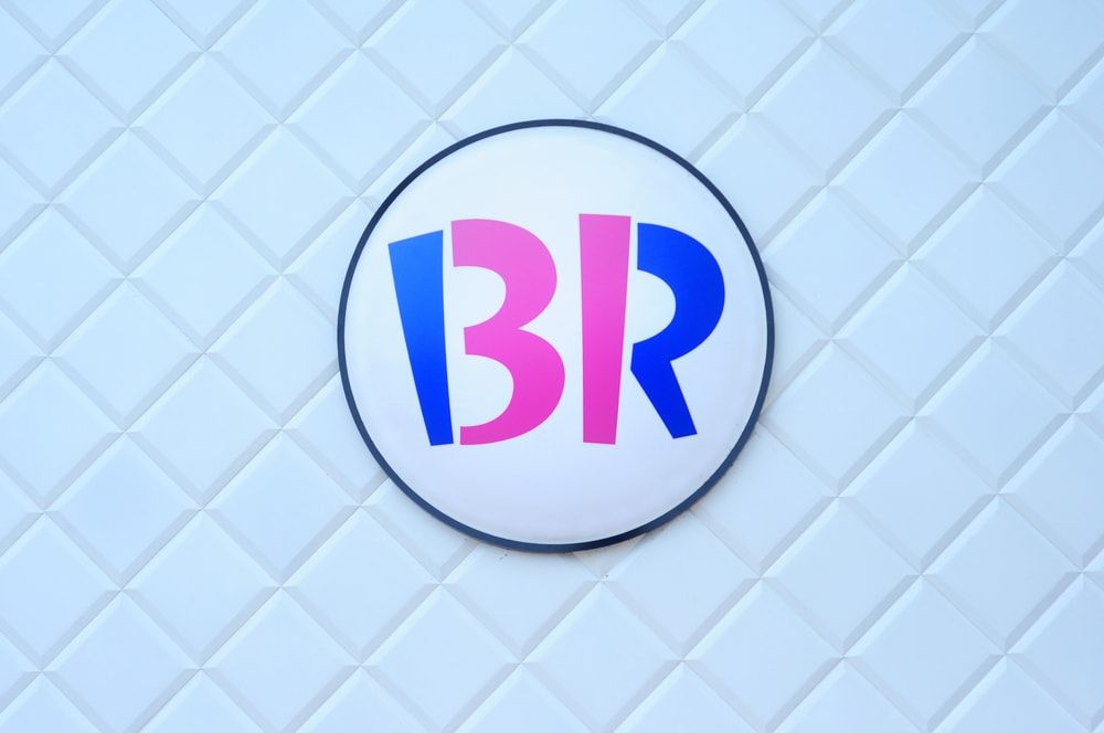
But, yet again, there is a hidden message here.
We all know the brand is known for having thirty-one flavors…
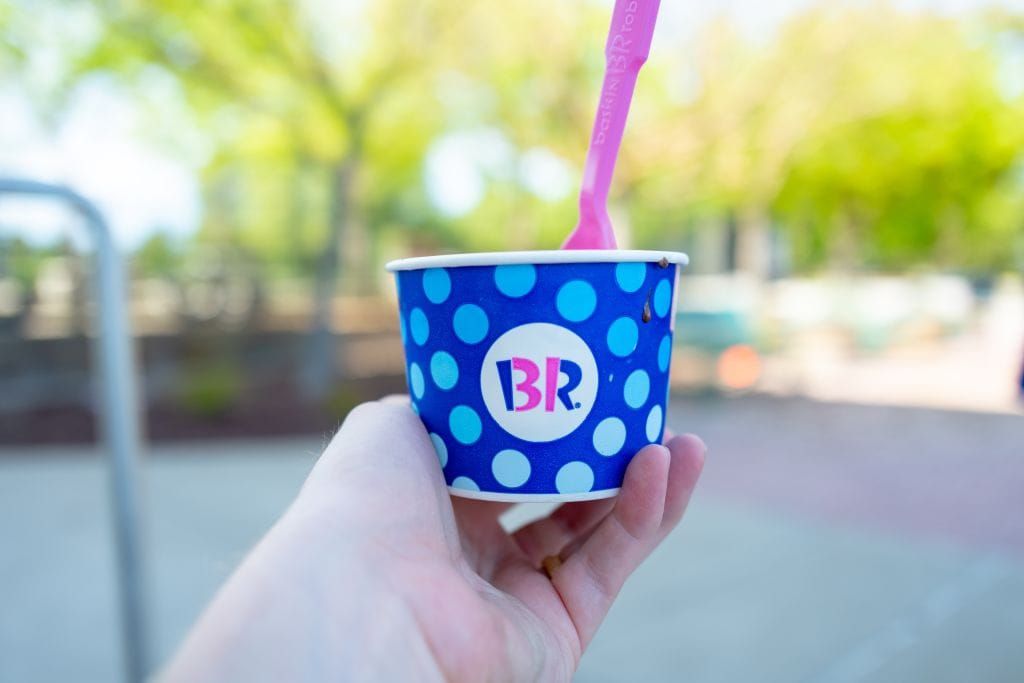
However, did you realize that there is actually a ‘3’ and ‘1’ hidden amongst the ‘B’ and the ‘R’ of the logo?
The Formula 1 logo follows a similar vein…
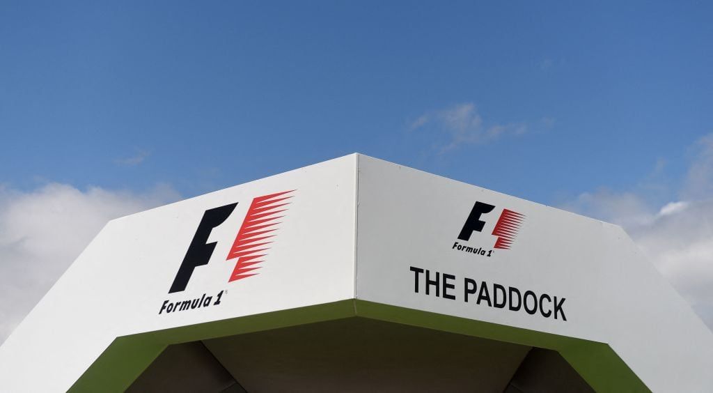
There is a hidden ‘1’ between the ‘F’ and the red speed lines.

It doesn’t just spell out an ‘H’ for the brand’s name…
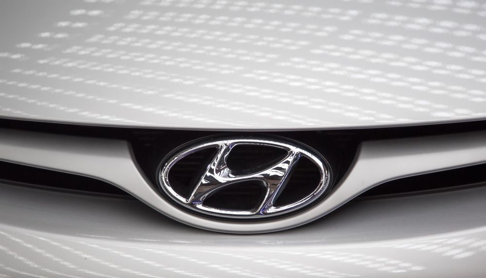
It is actually supposed to look like 2 people shaking hands, to signify satisfaction and trust between the company and the customer. How sweet!
The meaning behind Quiksilver’s logo is rather deep…
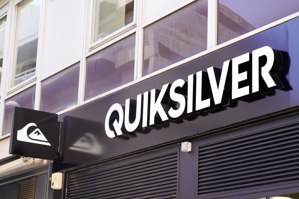
And it’s one we never would have guessed.
It’s actually a stylized version of The Great Wave off Kanagawa print.
It’s not just as simple as recreating the waves, as Mount Fuji is actually featured in the background too.
Cisco has one of the sleekest logos out there.
The tech company know how to do branding right.
But when you realize that the lines mirror San Francisco’s Golden Gate Bridge, it makes you recognize just how clever the symbol is too!
Did you notice that?

It is actually designed to be a peacock.
If you look closely, you will spot its little head in the middle!
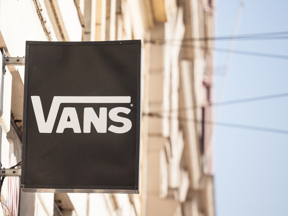
However, one of the latest logo realizations is on behalf of the sneaker brand Vans.
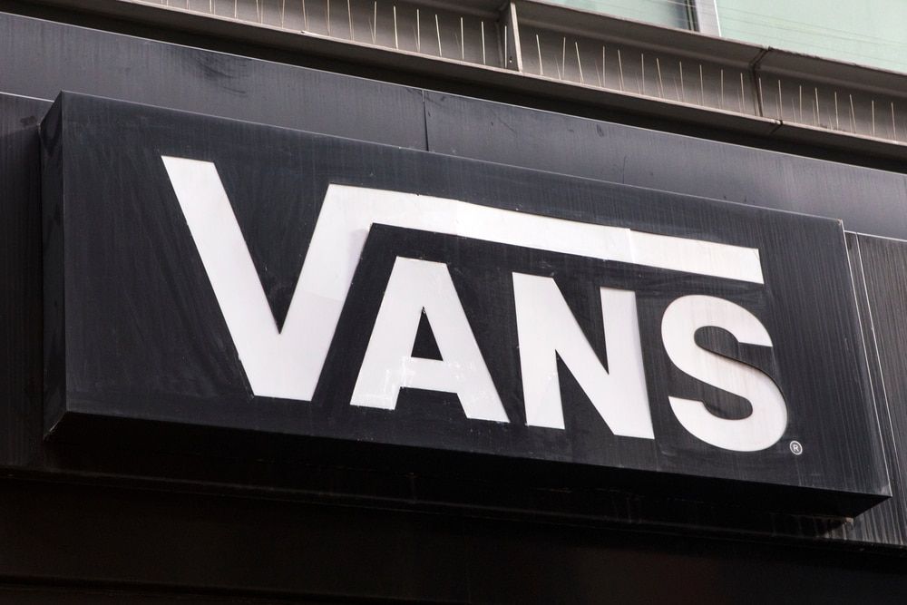
The company is known for its cool skater apparel.
But now, fans of the brand on TikTok have figured something out.

And we have to say, it has left us mindblown…
The ‘V’ in the name is actually extended over the rest of the letter.
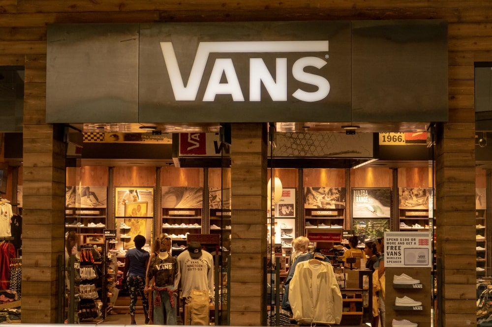
For those familiar with math, you might even say it looks like a square root symbol. In particular, the square root of the ‘ans’wer…
And if you’re really clever, then you will know that the square root symbol in itself is called a radical.

Pretty rad, right?
However, LADbible reports that this wasn’t actually intended to be the case.

The logo actually originates from the son of one of the founders, who created it way back in 1966.
Fans have taken to social media to share their thoughts on the new revelation…
One said: “Math? Well now I don’t wanna wear them.”
What do you think about all of these mindblowing logos?